Call of War 2.0 Preview

    This site uses cookies. By continuing to browse this site, you are agreeing to our Cookie Policy.

    • freezy wrote:

      Just some examples:
      - 3 years ago we replaced the Canvas 2D map look in CoW with the WebGL 3D map that you see currently in the game. This update has sparked alot of criticism in the beginning, but meanwhile nearly all of the current playerbase has grown fond of the current look. I am sure the same will be true with the new look that we will soon release.
      - 3 years ago we have also replaced the CoW1.0 balancing & mechanics with the CoW1.5 version. This update has sparked alot of criticism in the beginning, but meanwhile nearly all of the current playerbase has grown fond of the current balancing and mechanics.
      - 3 years ago we have also replaced the whole UI and maplook in S1914. This update has sparked alot of criticism in the beginning, but meanwhile nearly all of the current playerbase has grown fond of the current look. It also helped us to grow the game, the current userbase of S1914 is multiple times bigger than what it was before we updated the UI.

      You probably see a pattern here.
      Yes we probably see a pattern here... as you say COW playerbase is shrinking instead of growing...You guys are so enchanted by your stats and numbers and think they are all... But we live in a living world and the problem is you don`t have numbers for the mindset of your existing and potential players. Before it comes to your heads it is lost cause for anyone to explain something good to you. And as I posted in your facebook page ... just USE the good old survey thing.
    • TheRedMenace wrote:

      Well freezy I'm very glad to hear you like it at least, I'm sure that'll also satisfy everybody else's concerns with the new client. The jump from 1.0 to 1.5 was a lot less drastic than this and was done a lot better, the current client is so blatantly made for mobile not PC and just isn't as smooth or pleasant to use as the past one. It's nice to know that your response is essentially "Screw you guys and your concerns, just get used to it and stop complaining because we're going to ignore you". The way you have spoken to us, many of us years long fans of the game, is incredibly disappointing.
      The jump from CoW1.0 to CoW1.5 had the same kind of feedback as this update. Players were saying the same thing about it as they do now about the new clients. We had 50+ pages of back and forth discussions with users about it. Many threatened to quit and said this is the end of CoW and so on. And the same thing also happened when the WebGL version replaced the Canvas map. Really, this reaction we see now is nothing new, it was always like this when releasing new versions. No new version we released was liked immediately and none was perfect. Only after we continued to improve them and after players got used to them it got better. If you don't believe me, search for the old news announcements and feedback threads in the forums. I participated in all of them so I still remember.

      We are also not ignoring you. We just won't bring the old clients back. But that doesn't mean that we ignore you. We read all the feedback and concerns. But concerns like "the old thing was better, bring it back" we cannot solve, as we can't/won't bring it back. We can only fix and improve the new versions, and I can promise you, that we will. We try to fix most of the usability issues and bugs that players point out to us. We want to thank everyone in helping ou in that regard. We already have many fixes lined up for the next update.

      Sk4 wrote:

      Freezy.

      I'm sorry but I'm on my 124th game in 6 years and the ergonomics of the 2.0 PC is a regression compared to the 1.5. Have you ever played this game on PC ? Because, I don't know a single PC player yet who likes this new version...

      You all simply put mobile phone format on PC gameplay. You therefore sacrifice all the well-being of players who only play on PC.

      Even if your numbers are better in the future, that's not why you made the right decision with this version, it just means that you reached a wider audience regarding mobile phones... elsewhere many products do this, but often at the expense of quality. And sorry but I don't spend my whole life on this game, I saw the news only recently.

      I refuse to believe that it is a change for the ergonomic good... but rather I believe that it is economical like any profitable business. Where this game stood out precisely for its ergonomics, it now looks more like its competitors.

      There are lots of points that are completely sloppy compared to the old version... Like the display of resources, the new icons, the lack of visibility of the menus... in short, there is a nice page to write this version is so inconsistent with the old one.

      This is only a personal opinion but I have not yet met a player who appreciates this version, we all make the same observation or almost.


      Sorry for my English, I use the translator.
      Yes I play the game mostly on PC. I have no issues with the PC version and I like it. I already talked to quite some other PC players who started to like the new version, it was actually the feedback we got from beta players.

      Some menus on PC are similar to mobile, that is true and intentional. It makes switching back and forth between boh versions much easier, which actually many CoW players do (PC only players are not in the majority anymore since quite some time). But many PC menus are not in the mobile format at all. The game would not work if we put the PC interface on mobile 1:1, so I find this assessment that it is just a mobile game now over exaggerated, sorry. I can understand the concern of course, but it is no as bad. We want to strike a good balance between the two.

      If our numbers get better and the change ensures that the community is grown and Call of War stays relevant in years to come, then in my book it was the correct decision. Even if that is not true for every single player of the game, which I am sorry for. But we have a business to run and a community and game to keep alive and entertain, so we have to look at the big picture.

      As said before, we are going to improve the new version. So if you find that paricular aspects are an issue, feel free to report those, and we will have a look. We already have fixes and improvements lined up for the next update.

      (disclaimer: We of course won't overhaul the whole UI again, I am talking about specific improvements and minor changes within the UI, that's why we also need specific feedback & examples)

      K.Rokossovski wrote:

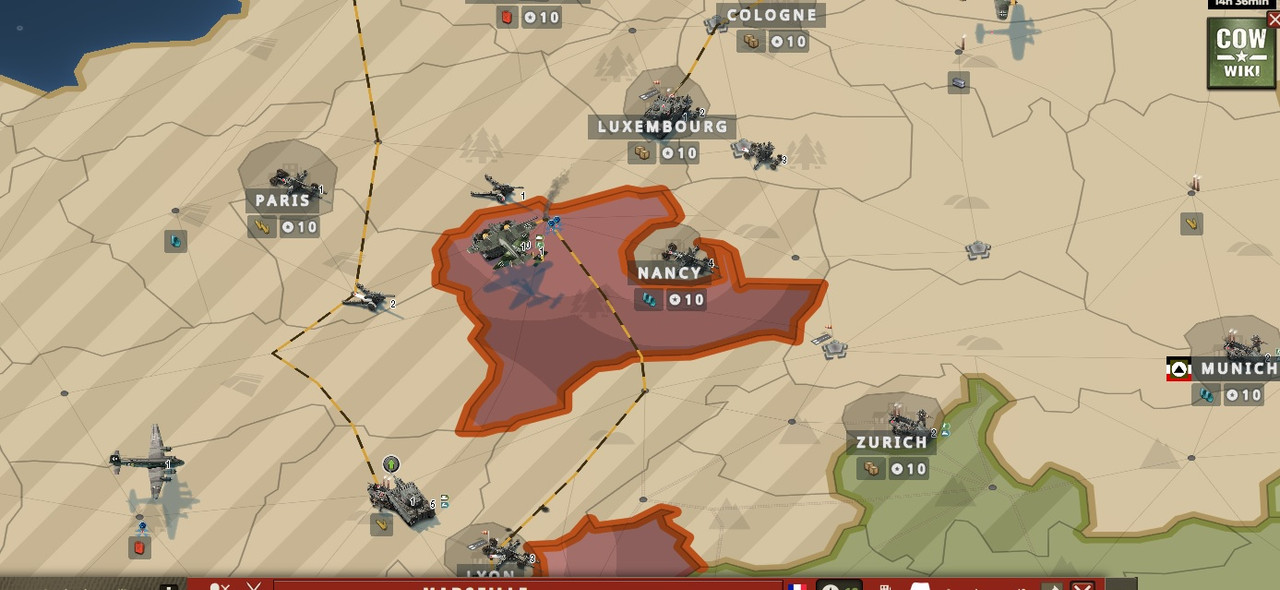
      Missing from this feature are, however:- The option to display all provinces (not just the cities), which is needed for building local industries and recrtuitment centers;
      - The option to sort on manpower, which is the easiest way to put your core cities on top of the list (it is also useful for building recruitment centers in provinces btw).

      As an aside, I wonder how new players would ever guess that they need to click on "classic view" to get get a list that is actually useful... but hey, you guys probably thought long and hard about that!
      Yes the missing button in the classic layout is known and going to be fixed in the next update.

      The non-classical layout is also useful, it is just a matter what you are used to. If a new player started the game and learned it in the new layout, they would find the new layout more useful. Since you played years with the old layout, you of course find the old layout more useful. It is all subjective and a matter of perspective and experience.
      But as said above, we can and will still do improvements, so if you have particular suggestions how to tweak the new layout, let us know.
    • K.Rokossovski wrote:

      Some other feedback:

      - When you want to check out a player and see his historical k/d ratio and such, this is shown in the "main menu of the site" view which means the actual game you're playing is closed. Now I'm smart enough to use the "back" button on my browser which works fine, but I can imagine not all people do that and are irritated that they need to go back to the main page and load the game again...

      - As someone else already mentioned, the actual game opening in a new tab of your browser was very nice and the main page remaining open was a very nice feature in the past, so sad it has gone now.

      - Two clicks to go from province view to "declare war" button is one too many, please return the old way of going to diplomacy screen directly (and to player view from there)

      - I really actively dislike the unit detail overlay. It opens with a bunch of numbers which are either incomprehensible (what on earth does it mean that the average damage of an armored car is 2.0? The average between light armored and unarmored attack values? But if so, why is an AA listed as 1.3?) or a complete open door (the roles - duh!), while you need to freaking SCROLLL DOWN to go to the actually useful information: the damage tables against various target types, and the speed and combat bonuses in various terrain types. PLEASE PLEASE PLEASE make it so that this vital information is displayed without the need to scroll!!
      Thanks for the suggestions!

      There is also a button in the upper right corner (which looks like a < or > ) of the interface which lets you switch back and forth between ingame and the home screen in less than a second. You don't need to use the browser back button for that.

      New tab opening is indeed a functionality that is missing. I can't promise it will be back but we can discuss it again. As a workaround you can copy the URL and open the game in a second browser tab and just keep those 2 tabs open in parallel.

      To go from the province view directly to the diplomacy menu you only need one click. Click on the flag icon in the province bar to do so.

      When testing the game with new players we found many times that they are overwhelmed with all the stats and data presented to them. The new unit details panel accounts for that by showing a simplified summary of stats at the top. The average damage value is usually the damage dealt to ground units (there are some exceptions). By showing a low average damage but a high anti air damage we showcase with just 2 numbers that this unit is not good in fighting anything but very good in defending vs aircraft.
      Also the displayed unit roles might be obvious to experienced players, but they are very useful to newer players who do not know all the roles yet.

      For units that are already on the map: To get more useful damage stats you should rather open the army damage table, by clicking on the info button in the army bar. This directly shows you a damage table how much damage your army does vs. each armor class. Those damage numbers are already adjusted by efficiency, so those are the actual numbers your armies will use in combat. So checking this and summing it up for each individual unit is not needed. Those damage numbers are also shown in the army details panel btw, when clicking on the army name in the army bar.

      z00mz00m wrote:

      This is a big one, agree completely.

      It's like someone tried to make the game less "nerdy" and more "accessible" by summarizing what a unit is for:
      "Build this to attack things, because it does pretty good damage to enemies."
      But this is a game of numbers, and it's all about unit stacking, matchups, and proper use of terrain.
      When the UI tries to steer in a different direction, it's not making the game more accessible.
      The UI needs to be true to the game.
      I get what the designers are trying to do, making it more tactile and RPG-like, but it's not a good fit.
      Looking at the UI as a board gamer, I can see front+back sides of cards arranged vertically.
      It's cool in a way, and it would be nice in another game, but it simply does not fit CoW.
      Same answer as above, please check it out.

      denislav77777 wrote:

      Yes we probably see a pattern here... as you say COW playerbase is shrinking instead of growing...You guys are so enchanted by your stats and numbers and think they are all... But we live in a living world and the problem is you don`t have numbers for the mindset of your existing and potential players. Before it comes to your heads it is lost cause for anyone to explain something good to you. And as I posted in your facebook page ... just USE the good old survey thing.
      I didn't say that the CoW playerbase was shrinking, I was saying that our other game S1914 started to grow much faster than CoW, thanks to the new clients that we introduced in S1914. Growing CoW became harder in recent times, so in order for CoW to stay relevant in the years to come, we needed to overhaul it to make competitive with other modern strategy games. The new clients were already proven in our other games, so this is not some experimental change, but a calculated one.

      I also already explained that having 1 unified client among all of our games makes future development much easier and less error-prone (more features, less bugs), which should benefit players in the long run as well.

      Well, the stats and numbers paint the most objective picture, much more objective than all the feedback in this forum combined. But even then we still look out for feedback and already fixed many issues that players pointed out to us, just as we did in the past after we introduced CoW1.5 or after we replaced the Canvas 2D map with the 3D WebGL map. No new version that we introduced was ever perfect. But we always improved and so we will also improve the new clients.

      So to reiterate: We will no bring the old client back. But we will improve the new client, fix issues and so on. So feedback like "bring back the old client" won't do anything at all. But posting specific feedback for specific issues will help, as then we can improve those issues. And we thank every player who takes the time to do so, and also every player who gives the new clients a chance! It is still the same game, fun as ever, just some things are in different places.
    • freezy wrote:

      When testing the game with new players we found many times that they are overwhelmed with all the stats and data presented to them. The new unit details panel accounts for that by showing a simplified summary of stats at the top. The average damage value is usually the damage dealt to ground units (there are some exceptions). By showing a low average damage but a high anti air damage we showcase with just 2 numbers that this unit is not good in fighting anything but very good in defending vs aircraft.
      Also the displayed unit roles might be obvious to experienced players, but they are very useful to newer players who do not know all the roles yet.
      Well like it or not, the game IS about a lot of numbers, and understanding how they are used. Even to a new player, a figure like "the average damage of this unit is six" doesn't mean anything. When he is interested in the game and wants to learn it, he should learn that it is about those base numbers - that tanks attack best in planes and infantry defends best in cities, but also pretty good in forests, and stuff like that. It doesn't help him to hide that data behind "the average damage is six" (even if the roles say something about that, but then one word surely isn't enough). He's much better served by learning "all units have offensive and defensive values against various types of opponents" even if he can't yet grasp how those values are structured and which unit does what best - he'll know where to get back to when he's ready to take the next step in his learning curve. I really don't think hiding that data is useful to him; if he wants to get good at the game he'll need to learn at some point anyway.

      To give you an example: many noob players build huge stacks of tanks only to find they are destroyed from the air. In the values tables, it was plain to see - the 0.5 or 1.0 for AA value is clearly there. On the first page now, there is not a single indication that they might be vulnerable to air attack.

      The problem with the army damage table is, that it is already corrected for the terrain modifiers and such. When my army is currently driving through a hill province to get down to a plains province to attack some enemy, the hills values are hardly relevant right now - I need the plains values. It is a similar thing like displaying the truck values for refueling planes - I don't need those, I want to know how much damage I will deal when we're ready to go out again. Despite your (the developer) best effort to help me, the player, it is very hard to determine what I'll want to know - and the only way to make sure I get the data I need is to present the raw data and allow me to make my own calculation. Yes, it probably takes some advanced game knowledge to be able to do that calculation; but on the other hand, understanding that calculations allows me to make the strategic choices to alter the modifiers to my favor - which is basically what the game is all about. And the sooner you introduce new players to the core of the game, the sooner they will learn how to do that math as well, and be my expert enemies of tomorrow.
      When the fake daddies are curtailed, we have failed. When their roller coaster tolerance is obliterated, their education funds are taken by Kazakhstani phishers, and their candy bars distributed between the Botswana youth gangs, we have succeeded.
      - BIG DADDY.
    • freezy wrote:

      Yes the missing button in the classic layout is known and going to be fixed in the next update.

      The non-classical layout is also useful, it is just a matter what you are used to. If a new player started the game and learned it in the new layout, they would find the new layout more useful. Since you played years with the old layout, you of course find the old layout more useful. It is all subjective and a matter of perspective and experience.
      But as said above, we can and will still do improvements, so if you have particular suggestions how to tweak the new layout, let us know.
      This strongly reminds me of an old sore, the Canvas debacle. You have a tendency to replace a feature, set the new version as the default, keep the old feature available to prevent player riots, but add the word "classic" or "legacy" to it, then remove it from the game a year later when none of the new players even knows it ever existed at all. So when you say this, I fear for the life of this "classic" view.

      Strictly speaking, a list like this isn't needed: you could just go to all the individual provinces from the main map and manage your stuff from there. The list is supposed to make mass management of an expanding empire easier; group provinces of a certain type together by filtering and sorting, for example, and work with them as a group. You're not watching every tile of the floor of your house anymore; you helicopter above it, so you can see the pattern of the tiles.

      To make such a list useful, you need a certain level of "zoom out". You can only start seeing the pattern when there is a certain amount of tiles visible at the same time. Of course you don't need to see the entire floor; the individual tiles still need to be seen so you shouldn't zoom out too far. The "classic" list did this pretty well, showing six or seven provinces even at a small phone screen.

      I'll readily agree that the LOOK of the new list is much better than the old one: there are nice frames and icons and the items in the list look really neat. The zoom level of the new list is only 2.5 though (provinces seen at once on a phone). That's really too little for the intended purpose, mass management of provinces. New players (who don't know about "classic" view) will simply assume that there is no support for mass management. They'll accept that, sure, they don't even call it "mass management" in their minds and don't even imagine that it COULD exist; many games have clumsy interfaces so why would this one be any different?

      But for you, as a developer, it SHOULD matter. The list is meant to support the player in his management; and no matter if the player is aware yet of his own desire, you should please him by offering him the option BEFORE he is aware; so he'll be glad of this feature and use it to optimize his gaming experience. You HAVE such a list; in fact many players use it everyday, for many years, with great pleasure. People like me, who are happy with this list, immediately miss it when it is (or seems to be) gone.

      So why not please your new players as well? Why not surprise them with a good and useful feature, presented to them with pride, and not hidden behind some obscure-sounding "classic" label in a scarcely visited settings screen?
      When the fake daddies are curtailed, we have failed. When their roller coaster tolerance is obliterated, their education funds are taken by Kazakhstani phishers, and their candy bars distributed between the Botswana youth gangs, we have succeeded.
      - BIG DADDY.
    • Is this 2.0 version make that at day 6 in one game the 80% of the players don't leave?
      You are killing the game, since someone at the top thought that a mobile game will give more profits, so enjoy the results.
      PD. excuse my mistakes in english.
      Si no tienes posibilidades de vencer, es el momento de atacar.
    • Average_Luz wrote:

      Bro at day 6 I was the only one left

      This is a common complaint. I make the same one, regularly. It's both a symptom and its own problem.

      There may be a lot of "players" in games like CoW and S1914 but most are not very good, or very engaged. They start a bunch of maps, send the initial wave of units, and then leave when the game slows down. Many of them joined because they saw ads with units zooming around the map, spewing fire.

      I especially like the CoW ad where a 3 single interceptors kill 3 single tanks, which blow up in big fireballs. Yeah, way to market a strategy game. Imagine being the person who liked that ad and tried CoW because of it.

      What happens is all these new players came for something more action-oriented. There's a mismatch between what the game promises and what it delivers. Now the UI wants to cater to these players who want a "quick" surface understanding. But these are not the players who are going to play a strategy game for 7-14 days. It doesn't matter how much you bend the UI, they don't have the interest or the patience.

      I guess what we're all saying is to please, please leave some semblance of the CoW that we all joined years ago because we loved the strategy, and the planning, and the human-human diplomacy. We didn't join for fancy animations. And we're not eager to leave, unless you break the game so much that it's no longer playable.

      We're not there yet, but we're worried. Taking away large empire management is another punch to the gut. How are we supposed to play a large 100 player world map, looking at 2 cities at a time? Like seriously, has anyone though about this?
    • Day 8. Antártida map, 40 players, only 3 still remains. One of these 3 is a goldenboy, he makes from the nothing like 20 medium tanks, jets...and has said to me "What is the problem? you don't have gold?" This is the game today, also dizzy graphics, you need to scroll and scroll, the Province administration looks so small and feel I can't look the screen for so long... I just want a strategy game, if I want another pay to win game and fight against the AI for days I will play it, not CoW.
      Time to say goodbye after 7 years, I think.
      Pd. excuse my mistakes in english.
      Si no tienes posibilidades de vencer, es el momento de atacar.
    • rdy2rocknroll wrote:

      Is there a way you can put each LVL of building and what the upgrades do back in the description, used to be able to tell what each lvl would do to times ect. It only shows what the current lvl will do.
      Click on the arrows to the left and right of the panel, you can cycle through all levels and see how the effects and stats change. Same is possible for units btw.